Imagine you launch a new custom hoodie on your Shopify store. The colors look bold, bright, and perfect on the product page. A customer places an order. A few days later, the message arrives:
“Why does the print look darker than the preview?”
If you sell custom t-shirts, hoodies, mugs, posters, or any printed product, this situation probably feels familiar. What looks vibrant on a screen can turn dull in real life. That gap between preview and print is where many sellers lose profit, trust, and repeat customers.
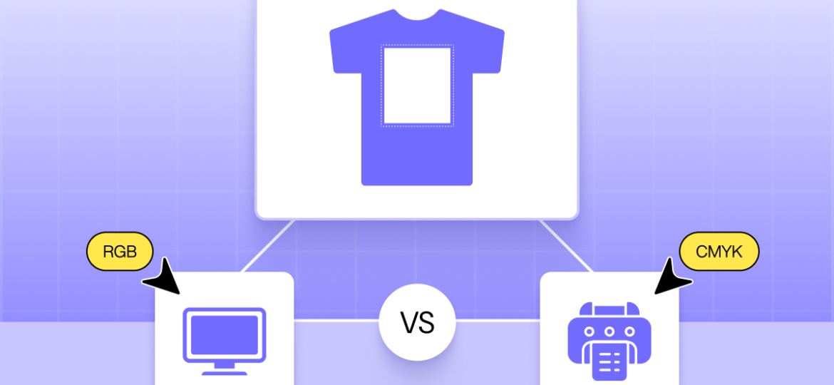
The reason often comes down to two simple terms: CMYK and RGB.
They may sound technical, but they directly affect your product quality, refunds, reviews, and brand reputation. When you understand how these color modes work, you can prevent color mismatches, reduce complaints, and deliver prints that match customer expectations.
Table of Contents
In this guide, we’ll break down CMYK vs. RGB in plain language and explain what Shopify sellers need to know before sending designs to print.
What is RGB color?
So, let’s dive into the first half of the “CMYK vs RGB” equation. You’re probably reading this on a phone, a laptop, or a desktop monitor right now. Take a good look at your screen. See that bright, vibrant logo on your Shopify dashboard? That’s RGB.
Think of RGB as the language of light.
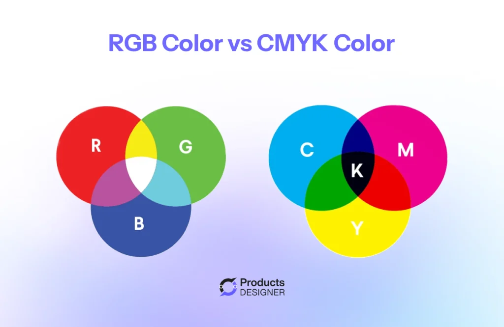
RGB stands for Red, Green, and Blue. Your computer monitor, your iPhone, and even that giant digital billboard on the highway, they all use light to create images. It’s like they have millions of tiny little flashlights inside them. When those flashlights shine red, green, and blue light at different brightness levels, they can trick your eye into seeing every color imaginable.
A simple way to picture it:
Imagine you’re in a completely dark room. If you shine a red flashlight on the wall, you see red. If you shine a green one right on top of it, suddenly that spot turns yellow. Add a blue one, and you’re getting closer to white. That’s the magic of RGB. When you mix lights, they get brighter and create new colors.
Why does this matter for your store?
Because everything you design for your website lives in this RGB world.
- Your Product Photos: That perfect, bright red hoodie in your product photo? It looks that way because your camera captured it and your screen is using RGB light to show it to you.
- Your Logo Files: If you had a designer create your brand logo, the file you use for your website (like a PNG or JPEG) is almost certainly using RGB to keep those colors popping.
- Your Ads: When you run a Facebook or Instagram ad for that same hoodie, you’re asking Meta’s servers to display your RGB image on your customers’ RGB screens.
The goal of RGB is to look vibrant, punchy, and full of life. It has a massive range of colors, actually, a wider range than print. This is where the “CMYK vs RGB” headache begins for most merchants. You’re building a beautiful, bright brand using light (RGB), but the second you hit “order samples” or send that design to a printer, you’re speaking a completely different language.
What is CMYK color?
Let’s look at the other side of “CMYK vs RGB.” If RGB is for screens, CMYK is for everything you can touch.
CMYK stands for Cyan, Magenta, Yellow, and Key (Black) . These are the four standard inks used by most printers. Whether you’re printing a t-shirt, a poster, or a mug, this is likely how your product gets made.
Think about painting with watercolors. You start with a white sheet of paper. When you add paint, the colors get darker. You can’t mix paints and end up with something brighter than when you started. You end up with something closer to black.
Printing works the same way. The printer places tiny dots of cyan, magenta, yellow, and black ink onto the material. These dots blend together to create the final image. Because you’re adding ink to a surface, the colors naturally become darker and more muted than what you see on a screen.
Why this matters for your store?
This is where most color complaints start. Your screen uses light, which can produce bright neons and vibrant shades. CMYK ink cannot match every color that your screen shows.
For example, that bright neon green in your logo might print as a darker, forest green. That soft pastel pink might look heavier and more saturated on a shirt. It’s not that the printer made a mistake. It’s that the printer can only work with the colors it has four standard inks on a physical surface.
The practical difference:
RGB is for your website, social media, and digital ads. It keeps colors bright to grab attention online.
CMYK is for your printed products. It ensures the physical item matches what the customer expects.
If you design a product mockup on your computer in RGB, the colors will look perfect on screen. But when that file goes to the printer, the machine has to convert those bright RGB colors into the more limited CMYK range. That conversion often results in duller colors and unhappy customers.
What you can do:
Before you send any design to a supplier, check your file settings. If you’re using design software like Adobe Illustrator or Photoshop, switch the color mode to CMYK before you start working. You can also ask your print provider for a physical proof or a digital color swatch to confirm the final look.
When to use CMYK vs RGB
Now you know the difference. RGB is for screens. CMYK is for ink. But how does that apply to your actual work as ecommerce seller? Here is a simple rule to follow: Design in the color mode that matches the final destination.
Use RGB when:
- You are creating images for your Shopify product pages
- You are designing social media graphics or ads
- You are sending email newsletters with product photos
- You are creating digital mockups to show customers online
Everything that lives on a screen should stay in RGB. It gives you the brightest colors and the widest range. This helps your products look appealing and stops people from scrolling past.
Use CMYK when:
- You are sending artwork to a t-shirt printer or print-on-demand supplier
- You are designing product packaging that will be printed
- You are creating business cards, flyers, or posters
- You are ordering samples from a manufacturer
Anything that gets printed should be converted to CMYK before you send the file. This ensures the printer uses the correct ink formula. It also lets you see a more accurate preview of how the colors will actually look on paper or fabric.
What happens if you use the wrong one?
If you send an RGB file to a printer, the printing machine has to guess how to convert it. It automatically shifts the colors into CMYK mode. That guess is rarely perfect. Bright blues turn purple. Neon greens turn muddy. Your customer gets something they didn’t expect, and you get a refund request.
If you design a product label in CMYK but forget to convert it back to RGB for your website, the colors on your product page will look flat and dull. Customers might not click “buy” because the item looks faded in the photo.
A simple workflow for Shopify sellers:
- Do your design work in RGB. It gives you more color options and looks better on your screen.
- When the design is finished, save a copy. Keep one RGB version for your website and ads.
- Convert the other copy to CMYK using your design software. Send this version to your printer.
- Order a physical sample before selling a new product. This confirms the CMYK conversion worked and the colors match your brand.
How does color choice affect ink cost and print efficiency?
You might think color choice is just about looks. Pick a color that matches your brand, send it to the printer, and move on. But the colors you choose actually affect how much you pay to produce each item and how long it takes to make them. This is where the difference between CMYK vs RGB stops being just a technical detail and starts affecting your profit. Every color adds cost.
Most printing methods use CMYK ink. When you design a t-shirt with large areas of solid color, the printer uses more of those four inks. More ink means higher production costs. Those costs either eat into your profit or get passed to the customer. Think of it like printing a document at home. A page with a small logo uses almost no ink. A page with a full-color photo covering the whole sheet empties your cartridge fast. The same logic applies to hoodies, mugs, and posters.
RGB designs trick you into using more ink:
This is the hidden trap. When you design on your computer, you’re working in RGB. The colors look bright and beautiful on your screen. But RGB has a wider color range than CMYK. So you might pick a vibrant purple that looks perfect in RGB, not realizing that to create that purple in CMYK ink, the printer has to layer heavy amounts of cyan and magenta. What looked like a simple color choice in RGB actually requires heavy ink coverage in CMYK. That heavy coverage costs more and takes longer to dry.
Spot color vs Full color:
If you use screen printing for t-shirts, each color in your design requires a separate screen. A design with three colors needs three screens. The printer has to set up each one, line them up perfectly, and clean them after. That setup takes time and labor.
This is why you often see higher setup fees for multi-color designs. It’s also why some print-on-demand companies charge more for “all-over print” items. Those products use more CMYK ink and more machine time.
Dark materials cost more to print:
Printing a white design on a black hoodie uses more ink than printing a black design on a white hoodie. Why? Because the printer has to lay down a layer of white ink first as a base. Then it prints the CMYK colors on top of that. That extra layer doubles the ink usage and adds time to the print process. If you sell dark-colored apparel, factor this into your pricing. The blank garment might cost the same as a white one, but the printing cost will likely be higher.
Ink coverage affects shipping and drying time:
This one surprises most new sellers. Designs with heavy ink coverage take longer to dry. In a print shop, that means items sit on racks or conveyors longer before they can be packaged and shipped. If you offer fast shipping, heavy ink coverage can create delays on the production side. The printer can only move as fast as the ink dries.
Simple ways to control costs:
- Use smaller logos instead of full-front prints when starting out
- Limit your design to two or three colors
- Avoid large areas of solid ink on dark garments
- Ask your supplier if they charge more for high-coverage designs
- Consider placement. A left-chest logo uses less ink than a giant back print
- When designing, remember that what looks simple in RGB might require heavy CMYK ink coverage
Every color and every square inch of ink adds something to your cost. Understanding CMYK vs RGB helps you see why. The bright design on your screen has to be recreated with physical ink. That translation costs money.
That doesn’t mean you should avoid colorful designs. It means you should price your products accordingly. Know what your supplier charges for high-coverage prints. Build that into your retail price. And when you see a competitor selling a heavily printed hoodie for the same price as a basic one, you’ll understand why their profit margin might be smaller, or why they might be cutting corners on quality.
12 Most Popular Printing Methods for Custom Product Businesses
Read NowHow InkyBay solves the CMYK vs RGB problem for Shopify merchants
You’ve read it this far. You understand the difference between screen colors and ink colors. You know that sending the wrong file type to your printer causes dull prints and unhappy customers. But here’s the question every Shopify merchant asks: “How do I make sure this never happens to my orders?”
This is where InkyBay changes the view. The problem with most customizers. When a customer uses a typical product customizer on your store, they see bright RGB colors on their screen. They build a design they love. They place an order. Then you get the file. What do you usually get? A PNG or JPEG. Maybe a screenshot. Sometimes just a description of what the customer wanted.
Now you have to guess. Is that blue the customer picked actually CMYK friendly? Will the printer know exactly where to place each element? Will the colors come out right? You become the middleman between a customer who doesn’t understand CMYK and a printer who needs perfect files. That’s where mistakes happen. That’s where refunds start.
How InkyBay fixes this? InkyBay Product Customizer is built understanding the CMYK vs RGB conflict. Developers know that what looks good on screen doesn’t always print well. Developers also know that merchants don’t have time to fix customer files.
Here’s what happens when a customer uses InkyBay Product Personalizer to design a product:
The customer designs in a controlled environment called design lab. They see colors that are print-friendly from the start. The customizer guides them without them even knowing it. You receive a perfect order file. When the customer hits “add to cart,” InkyBay generates a print-ready file. But it doesn’t stop there. Every color code is included. The file doesn’t just show a picture. It includes the exact CMYK values, the color codes, and every detail the printer needs to reproduce the design accurately.
You now don’t have to guess. You don’t have to open the file and wonder if it will print right. You don’t have to email the customer asking what shade of blue they wanted. The file contains everything the printer needs to produce exactly what the customer designed.
Why this matters for your business? Think about the last time you had a print issue. Maybe the colors were off. Maybe the text was in the wrong place. Maybe the printer couldn’t open the file the customer sent. Every one of those issues costs you money. You spend time on support. You pay for a reprint. You lose trust with the customer.
With InkyBay, those issues disappear. The printer gets a file that’s ready to go. The colors match what the customer picked. You don’t touch the file at all. The customer gets what they expected. And why large Shopify merchants trust InkyBay? The biggest Shopify stores selling customizable products don’t have time to mess with color conversions. They process hundreds of orders a day. They need every order to flow from customer to printer without anyone touching it. That’s why they use InkyBay.
The software handles the CMYK vs RGB conversion. It ensures every design is print-ready before the order is placed. It gives printers exactly what they need. And it gives merchants peace of mind.
Conclusion
We started this CMYK vs RGB guide with a problem. A customer orders a custom hoodie. The preview looks perfect. The print arrives darker. Another refund. Another unhappy review. Another customer lost. That gap between preview and print is the CMYK vs RGB problem. It’s technical. It’s confusing. And for too many Shopify merchants, it’s a constant source of frustration.
But now you understand what’s really going on.
You know that RGB is light. It’s for screens. It’s bright and wide and perfect for your website and social media. You know that CMYK is ink. It’s for physical products. It’s more limited and more muted, but it’s the language every printer speaks. You know that choosing colors isn’t just about looks. It affects your ink costs, your production time, and your profit margins. Every square inch of coverage adds something to your bottom line.
And you know that the right tools, like InkyBay Product Customizer, make all the difference. When customers design their own products, you need a system that bridges the gap between what they see and what gets printed. You need something that delivers print-ready files with every order, so you never have to guess, fix, or explain why something went wrong.