From here you will find different settings for Inkybay.
Navigate to Settings >> General Settings.
Common Setting
This is the place where you can set or change your quote email address, currency symbol and default size unit of the design tool here.
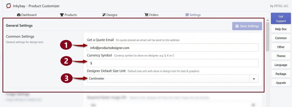
- Get a Quote Email: By default, Inkybay will set your email address as your default quote email address. This is where you will get an email notification when the customer sends a quote request. If you want to change the default one you can update it here. To change the email address, replace the existing email address with the new one.
- Currency Symbol: Here, you can set the currency symbol that you want to show in the design tool. By default, the currency symbol is $. But you can change it to any currency symbol. (for example ¥, £, €, etc).
- Designer Default Size Unit: Centimeter is the default unit to measure the sizes of images and texts in the design tool. But you can change it to Inch or Feet from here. Click on Centimeter, a drop-down menu will appear and then choose one.
Finally, Don’t forget to Save Settings when you make any changes.
Image Settings
Image setting is the place where you can set or change the limit of raster image DPI, show/hide Warning Message for ‘low-resolution image’ and ‘image outside the printing area’.
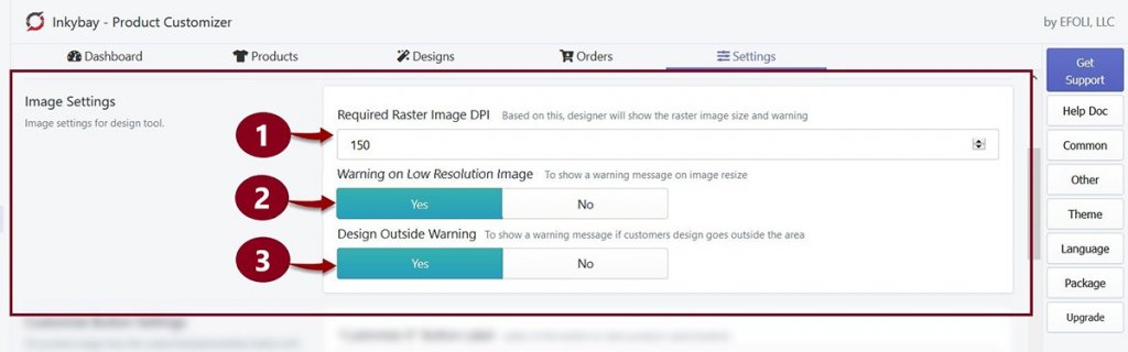
- Required Raster Image DPI: Very often your customers will upload low-quality images to design their product on the Designer page, or they may stretch a photo a bit much. As a result, printing quality will be compromised. To avoid printing quality issues, you can set required DPI (dots per inch).
By default, the raster image DPI is set on 150 in Inkybay but you can change it up to 300. - Warning on low-resolution image: When customers upload or stretch an image that crosses the DPI limit, a warning message pops up. Customers also can see the required image size when they hover their mouse on the warning sign. It helps your customers to get a good printing quality on their products.
However, If you don’t want your customers to see this warning, select NO - Design outside warning: This warning sign pops up when customers set a photo/graphics/text outside or some part of the photo is outside of the printing area.
If you don’t want your customers to see this warning, select NO
Customize Button Settings
If you want to change the title of ‘Customize it’ button of your store, or want the button style to match your store theme, then the Customize Button Setting is there to help.
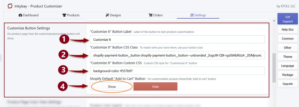
- Button label: Customers click on the ‘Customize it’ button of your store to design on their products, you can change this Customize it button label to anything you want. Replace the button label with your one to change it.
- Customize it button CSS class: To match the button with your store theme button style, enter the CSS button class of the theme you are using in the text field.
- Customize it’ button custom CSS class: Use your custom CSS in the text field to customize the button style as you need. You can add multiple CSS in the text field.
- Shopify Default Add to Cart button: When you make a product customizable in your Inkybay app, it automatically hides the Shopify’s default Add to Cart button and shows the Customize It button instead. If you want, you can activate the Add to Cart button on your product page, click on Show to active the button.
[N.B: if you use the Inkybay product options feature for your products, you must hide the default Shopify add to cart button to work it properly.]
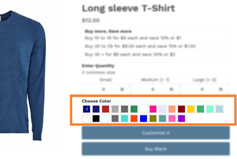
Product Page Color View Setting
This option is to show the color variants of a product on the product page. Inkyaby comes with a product color swatch to show on the product page. You can active/inactive this feature. Customers can choose from the available colors and preview it before they go to customize the product. The selected color variant will be shown when they open it on the design tool.
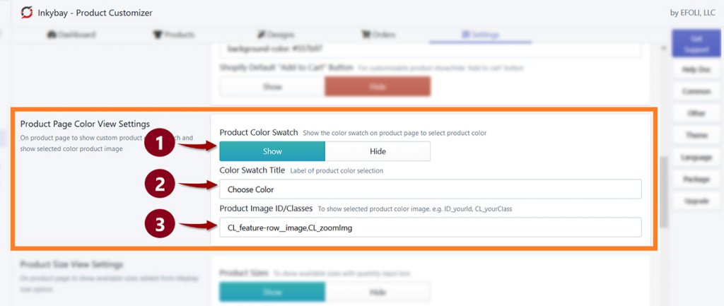
- Click on the Show button from Product Color Swatch to show the ‘Color Swatch/ Choose color’ option on the product page
- Color Swatch Title: The title of this color swatch option is ‘Choose Color’. This title is customizable. To change the option title, replace the name from the title box and enter a new title.
- Product Image Id/Classes: When customers click on the product color swatch to show the related product images in the preview. Sometimes the product image is not changed when clicks on the ‘product color swatch’ on the product page. It happens due to the Shopify theme you are using. To resolve the issue, enter the product image ID/class from the product page in the text box.
Product Size View Setting
This option is to display product size variants on the Shopify store’s product page.
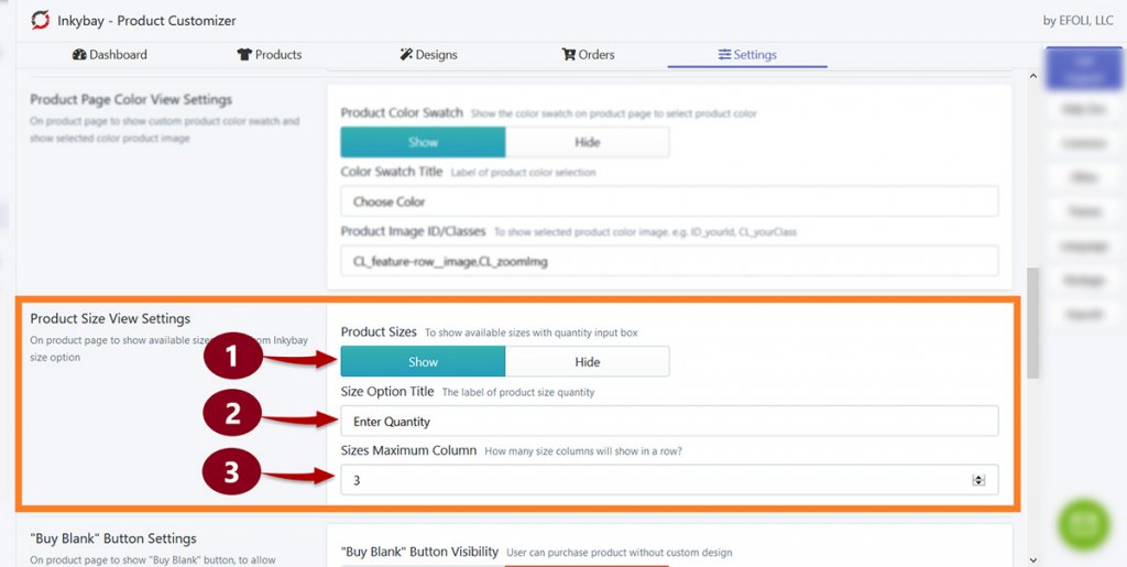
Every size option comes with a quantity box, customers can enter their required quantity in that box. By default, the quantity is set to 0 and the title of this section is ‘Enter Quantity’ on the product page.
N.B: You can change the minimum quantity, from 0 to anything. Change your minimum quantity setup(if needed) from the ‘printing type’ setting of this product
- Product Sizes: You can decide whether you want to show the product sizes on the product page or not.
- Size Option Title: You can also rename the title ‘Enter Quantity’. To do that, replace the title name with the one you want to show.
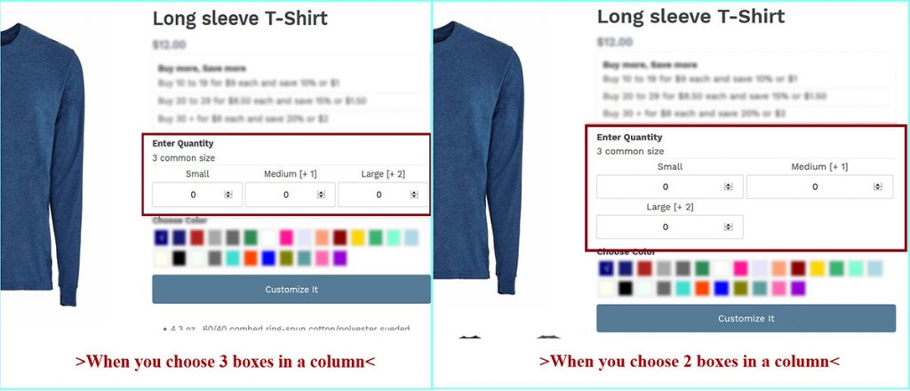
- You can manage the number of size options (box) in a column from the Sizes Maximum Column section. For example, if you choose 3 boxes in a column and you have 3 size variants then all the variants will be shown in a single column.
But, if you choose 2 boxes in a column for the 3 size variants then the first two size variants will be shown on the first column and a new column will be created to show the 3rd size variant.
‘Buy Blank’ Button setting
If you want to allow customers to purchase products without adding any custom design, this feature can help. A ‘Buy Blank’ button will be available on the Product page and designer page so that customers can buy the product without adding any custom design.
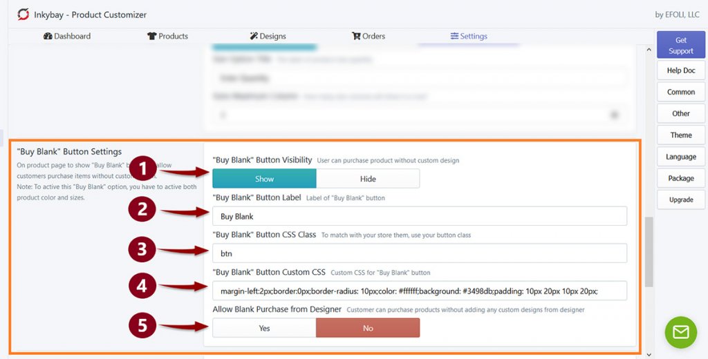
- Click on the Show button (from Buy Blank button visibility) to show the ‘Buy Blank’ button on the product page.
- ‘Buy Blank’ Button label: Default label of this button is ‘Buy Blunk’. This button label is changeable. To change the button label, replace the name and enter a new label.
- ‘Buy Blank’ button CSS class: To match the button theme with the store theme, enter the CSS button class of the original theme in the text box.
- ‘Buy Blank’ button custom CSS: Use your own choice to customize the Buy Blank button. Add custom CSS in the text field.
- Select Yes from the ‘Allow blank purchase from designer’ if you want to show the ‘Buy Blank’ button on the Designer page.
Still, if you face any further issues or need help, feel free to contact us. Our support team will be happy to help you.
You can always reach us via
- Support ticket from Inkybay app
- Live Chat in Inkybay app
- Direct email to support@productsdesigner.com
So, Good Luck! And happy selling with Inkybay.